
 搜索
搜索 阅读量:
阅读量: 收藏数:
收藏数: 点赞数:
点赞数:CSS 水平导航栏
水平导航栏

有两种方法可以创建水平导航栏。使用内联或浮动列表项。
内联列表项
构建水平导航栏的一种方法是指定 <li> 元素作为内联:
1 | li { display: inline;} |
示例说明:
display: inline;- 默认情况下,<li> 元素是块元素。在这里,我们删除每个列表项前后的换行符,以将它们显示在一行上
浮动列表项
创建水平导航栏的另一种方法是浮动 <li> 元素,并指定导航链接的布局:
1 | li { float: left;} |
示例说明:
float: left;- 使用float获取块元素,彼此相邻漂浮display: block;- 允许我们指定填充padding: 8px;- 指定一些填充在每个<a> 元素之间,使它们看起来不错background-color: #dddddd;- 为每个添加灰色背景色<a>元素
提示: 如果需要,请将 background-color 添加到 <ul> 而不是每个 <a> 元素全部填充背景色:
1 | ul { background-color: #dddddd;} |
水平导航栏示例
创建一个具有深色背景色的基本水平导航栏,并更改用户将鼠标移到上方时链接的背景颜色:

1 | ul { list-style-type: none; |
活动/当前导航链接
将“活动”类添加到当前链接,让用户知道他/她在哪个页面上:

1 | .active { background-color: #04AA6D;} |
右对齐链接
float:right;:通过将列表项向右浮动来右对齐链接 ():

1 | <ul> |
边界分隔线
border-right: 将属性添加到<li>以创建链接分隔符.

1 | /* Add a gray right border to all list items, except the last item (last-child) */ |
固定导航栏
使导航栏停留在页面的顶部或底部,即使用户滚动页面也是如此:
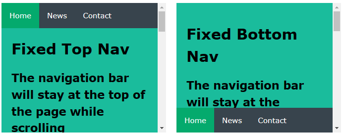
固定顶部
1 | ul { position: fixed; |
固定底部
1 | ul { position: fixed; |
注意: 固定位置可能无法在移动设备上正常工作。
灰色水平导航栏
带有灰色细边框的灰色水平导航栏示例:

1 | ul { border: 1px solid #e7e7e7; |
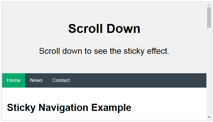
粘性导航栏
position: sticky;: 添加到 <ul> 以创建粘性导航栏。
粘性元素在相对和固定之间切换,具体取决于滚动位置。它是相对定位的,直到在视口中达到给定的偏移位置 - 然后它“粘”在原位(如 position:fixed)。
1 | ul { position: -webkit-sticky; /* Safari */ |
注意: Internet Explorer 不支持粘性定位。Safari 需要 -webkit- 前缀(参见上面的示例)。还必须指定 top、right、bottom、left中的至少一个 粘性定位工作。
更多示例
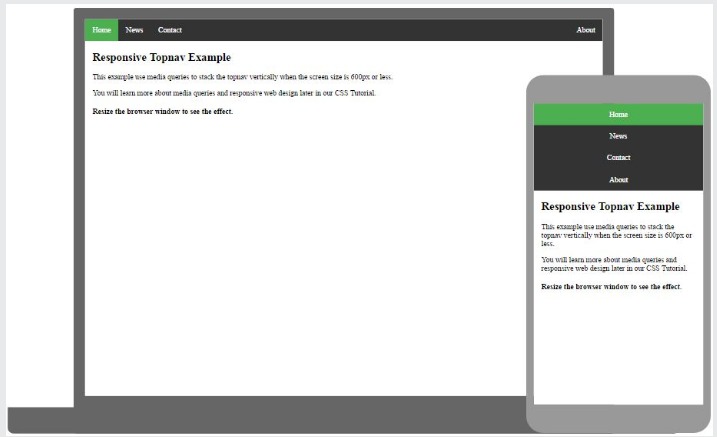
响应式 Topnav
1 | 如何使用 CSS 媒体查询创建响应式顶部导航。 |
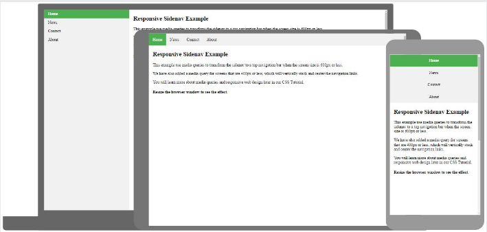
响应式侧导航
1 | 如何使用 CSS 媒体查询创建响应式侧边导航。 |
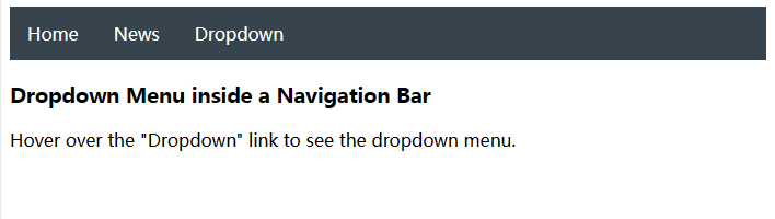
下拉导航栏
1 | 如何在导航栏内添加下拉菜单。 |


0评论