CSS 链接
使用 CSS,链接可以以多种不同的方式设置样式。
样式链接
链接可以使用任何 CSS 属性(例如color 、font-family 、 background等)设置样式。
此外,还可以设置链接的样式 根据他们所处的 状态 而有所不同。
这四个链接状态是:
a:link- 一个正常的、未访问的链接a:visited- 用户访问过的链接a:hover- 当用户将鼠标悬停在链接上时,链接a:active- 点击时的链接
1
2
3
4
5
6
7
8
9
10
11
| /* unvisited link */
a:link { color: red;}
/* visited link */
a:visited { color: green;}
/* mouse over link */
a:hover { color: hotpink;}
/* selected link */
a:active { color: blue;}
|
尝试一下 »
为多个链接状态设置样式时,有一些顺序规则:
a:hover 必须位于 a:link 和 a:visited 之后a:active 必须在 a:hover 之后
文字修饰
text-decoration: 该属性主要用于从链接中删除下划线。
1
2
3
4
5
6
7
| a:link { text-decoration: none;}
a:visited { text-decoration: none;}
a:hover { text-decoration: underline;}
a:active { text-decoration: underline;}
|
尝试一下 »
背景颜色
background-color:该属性可用于指定链接的背景色。
1
2
3
4
5
6
7
| a:link { background-color: yellow;}
a:visited { background-color: cyan;}
a:hover { background-color: lightgreen;}
a:active { background-color: hotpink;}
|
尝试一下 »
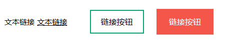
链接按钮
此示例演示了一个更高级的示例,其中我们将多个 CSS 属性组合在一起,将链接显示为框/按钮:
1
2
3
4
5
6
7
8
| a:link, a:visited { background-color: #f44336;
color: white;
padding: 14px 25px;
text-align: center;
text-decoration: none;
display: inline-block;}
a:hover, a:active { background-color: red;}
|
尝试一下 »
更多示例
1
2
3
4
5
6
7
8
9
10
11
12
13
14
15
16
17
18
19
20
21
| 此示例演示如何向超链接添加其他样式:
a.one:link {color: #ff0000;}
a.one:visited {color: #0000ff;}
a.one:hover {color: #ffcc00;}
a.two:link {color: #ff0000;}
a.two:visited {color: #0000ff;}
a.two:hover {font-size: 150%;}
a.three:link {color: #ff0000;}
a.three:visited {color: #0000ff;}
a.three:hover {background: #66ff66;}
a.four:link {color: #ff0000;}
a.four:visited {color: #0000ff;}
a.four:hover {font-family: monospace;}
a.five:link {color: #ff0000; text-decoration: none;}
a.five:visited {color: #0000ff; text-decoration: none;}
a.five:hover {text-decoration: underline;}
|
尝试一下 »
1
2
3
4
5
6
7
8
9
10
11
12
| 如何创建链接框/按钮的另一个示例:
a:link, a:visited { background-color: white;
color: black;
border: 2px solid green;
padding: 10px 20px;
text-align: center;
text-decoration: none;
display: inline-block;}
a:hover, a:active { background-color: green;
color: white;}
|
尝试一下 »
1
2
3
4
5
6
7
8
9
10
11
12
13
14
15
16
17
18
19
| 此示例演示了不同类型的游标(对于链接很有用):
<span style="cursor: auto">auto</span><br>
<span style="cursor: crosshair">crosshair</span><br>
<span style="cursor: default">default</span><br>
<span style="cursor: e-resize">e-resize</span><br>
<span style="cursor: help">help</span><br>
<span style="cursor: move">move</span><br>
<span style="cursor: n-resize">n-resize</span><br>
<span style="cursor: ne-resize">ne-resize</span><br>
<span style="cursor: nw-resize">nw-resize</span><br>
<span style="cursor: pointer">pointer</span><br>
<span style="cursor: progress">progress</span><br>
<span style="cursor: s-resize">s-resize</span><br>
<span style="cursor: se-resize">se-resize</span><br>
<span style="cursor: sw-resize">sw-resize</span><br>
<span style="cursor: text">text</span><br>
<span style="cursor: w-resize">w-resize</span><br>
<span style="cursor: wait">wait</span>
|
尝试一下 »

 搜索
搜索 阅读量:
阅读量: 收藏数:
收藏数: 点赞数:
点赞数:


0评论