二维码

HTML 响应式网页设计

HTML 响应式网页设计

响应式网页设计是关于创建在所有设备上看起来都不错的网页!

响应式网页设计将自动调整不同的屏幕尺寸和视口。

什么是响应式网页设计?

响应式网页设计是关于使用 HTML 和 CSS 自动调整大小、隐藏、缩小或放大, 一个网站,使其在所有设备(台式机、平板电脑和手机)上看起来都不错:

设置视口

若要创建响应式网站,请将以下标记添加到所有网页:<meta>

1
<meta name="viewport" content="width=device-width, initial-scale=1.0">

这将设置页面的视口,这将为浏览器提供有关如何操作的说明 以控制页面的尺寸和缩放比例。

下面是一个没有视口 meta 标记的网页示例,以及带有视口 meta 标记的同一网页:

不带视口 meta 标记:

使用 viewport meta 标记:

提示: 如果您在手机或平板电脑上浏览此页面,您可以单击上面的两个链接以查看差异。

响应式图像

响应式图像是可以很好地缩放以适应任何浏览器大小的图像。

使用 width 属性

如果 CSS 属性设置为 100%,则图像将具有响应性和缩放性 上下:width

1
<img src="img_girl.jpg" style="width:100%;">

请注意,在上面的示例中,图像可以放大到大于其原始大小。 在许多情况下,更好的解决方案是改用该属性。max-width

使用 max-width 属性

如果该属性设置为 100%,则图像将在必要时缩小,但绝不会放大到大于其原始大小:max-width

1
<img src="img_girl.jpg" style="max-width:100%;height:auto;">

根据浏览器宽度显示不同的图像

HTML 元素允许您为 不同的浏览器窗口大小。<picture>

调整浏览器窗口的大小,以查看下面的图像如何根据宽度而变化:

1
2
3
4
5
6
<picture>
<source srcset="img_smallflower.jpg" media="(max-width: 600px)">
<source srcset="img_flowers.jpg" media="(max-width: 1500px)">
<source srcset="flowers.jpg">
<img src="img_smallflower.jpg" alt="Flowers">
</picture>

响应式文字大小

可以使用“vw”单位设置文本大小,即“视口宽度”。

这样,文本大小将遵循浏览器窗口的大小:

1
<h1 style="font-size:10vw">Hello World</h1>

Viewport 是浏览器窗口大小。1vw = 视口宽度的 1%。如果视口宽 50 厘米,则 1vw 为 0.5 厘米。

媒体查询

除了调整文本和图像的大小外,使用媒体查询也很常见 在响应式网页中。

通过媒体查询,您可以为不同的浏览器定义完全不同的样式 大小。

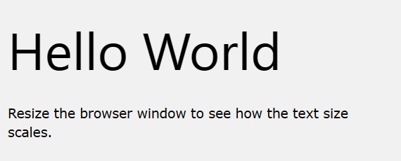
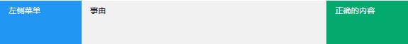
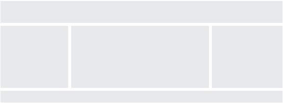
示例:调整浏览器窗口的大小,以查看下面的三个 div 元素将显示 在大屏幕上水平堆叠,在小屏幕上垂直堆叠:

1
2
3
4
5
6
7
8
9
10
11
12
13
14
15
16
17
18
<style>
.left, .right {
float: left;
width: 20%; /* The width is 20%, by default */
}

.main {
float: left;
width: 60%; /* The width is 60%, by default */
}

/* Use a media query to add a breakpoint at 800px: */
@media screen and (max-width: 800px) {
.left, .main, .right {
width: 100%; /* The width is 100%, when the viewport is 800px or smaller */
}
}
</style>
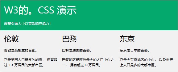
提示: 要了解有关媒体查询和响应式网页设计的更多信息,请阅读我们的 [RWD 教程]。

响应式网页 - 完整示例

响应式网页在大型桌面屏幕和小型手机上应该看起来不错。

响应式网页设计 - 框架

所有流行的 CSS 框架都提供响应式设计。

它们是免费的,并且易于使用。

W3的。CSS的

W3的。CSS 是一个现代 CSS 框架,支持台式机、平板电脑和移动设备 默认设计。

W3的。CSS 比类似的 CSS 框架更小、更快。

W3的。CSS 被设计为独立于 jQuery 或任何其他 JavaScript 库。

1
2
3
4
5
6
7
8
9
10
11
12
13
14
15
16
17
18
19
20
21
22
23
24
25
26
27
28
29
30
31
32
33
34
35
36
<!DOCTYPE html>
<html>
<meta name="viewport" content="width=device-width, initial-scale=1">
<link rel="stylesheet" href="https://www.w3schools.com/w3css/4/w3.css">
<body>

<div class="w3-container w3-green">
<h1>W3Schools Demo</h1>
<p>Resize this responsive page!</p>
</div>

<div class="w3-row-padding">
<div class="w3-third">
<h2>London</h2>
<p>London is the capital city of England.</p>
<p>It is the most populous city in the United Kingdom,
with a metropolitan area of over 13 million inhabitants.</p>
</div>

<div class="w3-third">
<h2>Paris</h2>
<p>Paris is the capital of France.</p>
<p>The Paris area is one of the largest population centers in Europe,
with more than 12 million inhabitants.</p>
</div>

<div class="w3-third">
<h2>Tokyo</h2>
<p>Tokyo is the capital of Japan.</p>
<p>It is the center of the Greater Tokyo Area,
and the most populous metropolitan area in the world.</p>
</div>
</div>

</body>
</html>

要了解有关 W3.CSS,请阅读我们的 [W3。CSS 教程]。

启动

另一个流行的 CSS 框架是 Bootstrap:

1
2
3
4
5
6
7
8
9
10
11
12
13
14
15
16
17
18
19
20
21
22
23
24
25
26
27
28
29
30
31
32
<!DOCTYPE html>
<html lang="en">
<head>
<title>Bootstrap 5 Example</title>
<meta charset="utf-8">
<meta name="viewport" content="width=device-width, initial-scale=1">
<link href="https://cdn.jsdelivr.net/npm/bootstrap@5.2.3/dist/css/bootstrap.min.css" rel="stylesheet">
<script src="https://cdn.jsdelivr.net/npm/bootstrap@5.2.3/dist/js/bootstrap.bundle.min.js"></script>
</head>
<body>

<div class="container-fluid p-5 bg-primary text-white text-center">
<h1>My First Bootstrap Page</h1>
<p>Resize this responsive page to see the effect!</p>
</div>

<div class="container mt-5">
<div class="row">
<div class="col-sm-4">
<h3>Column 1</h3>
<p>Lorem ipsum...</p>
</div>
<div class="col-sm-4">
<h3>Column 2</h3>
<p>Lorem ipsum...</p>
</div>
<div class="col-sm-4">
<h3>Column 3</h3>
<p>Lorem ipsum...</p>
</div>
</div>
</div>

要了解有关 Bootstrap 的更多信息,请转到我们的 [Bootstrap 教程]。